Harbour House Hotel Rebrand
-
Harbour House Hotel is an accommodation on Salt Spring Island. It caters towards being a venue for larger groups, like corporate retreats or weddings.
Their branding, however, misses a lot of heart and history involving where they were founded. It was my task to try to respect and showcase this while keeping their existing focus intact.
The challenge was in keeping the logo authentic, rustic, yet still refined. I also needed to make an identity that paid homage to the quite interesting history behind the location.
-
My approach was clear to me. I wanted to de-emphasize the generic ‘elegant’ feeling and bring in one that was more welcoming and that paid homage to the location’s past.
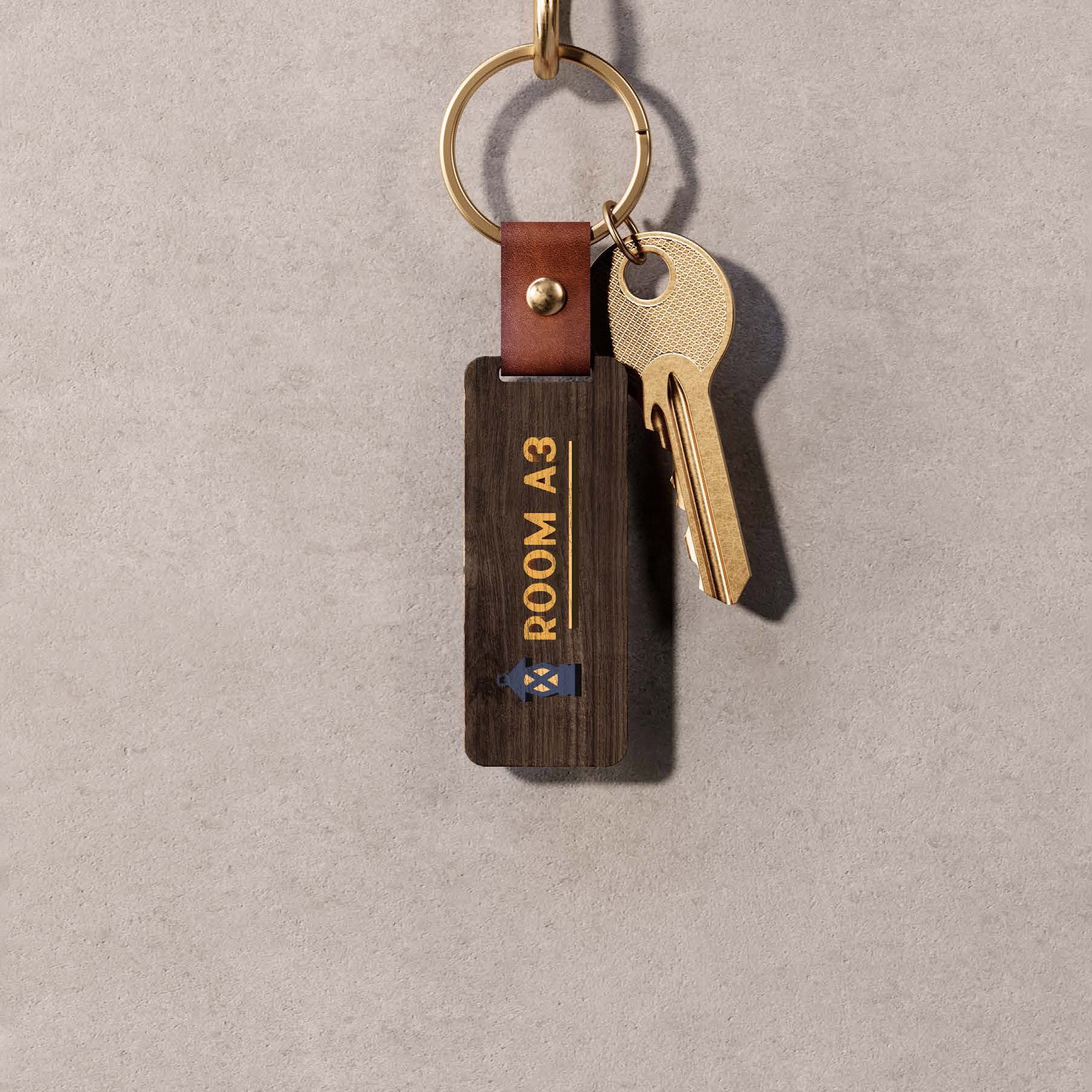
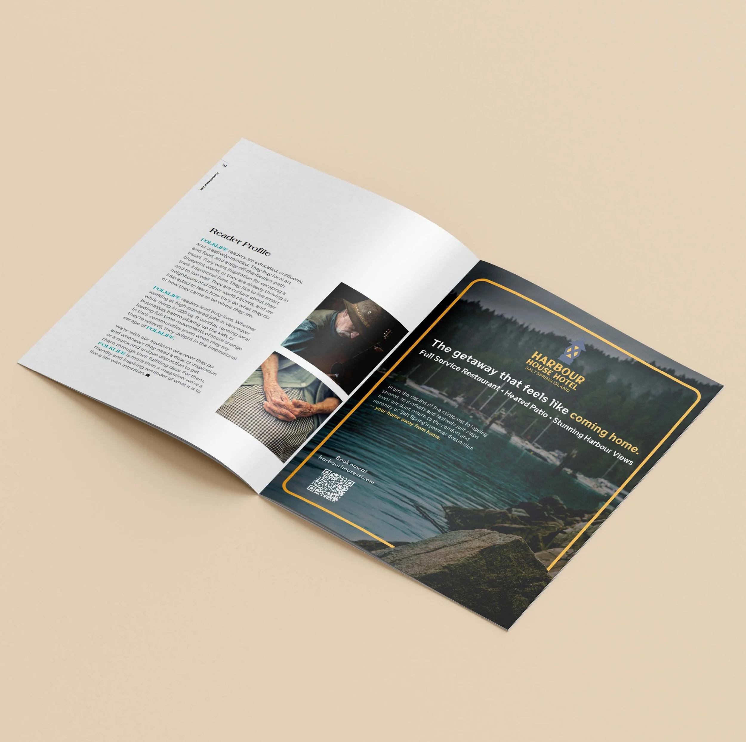
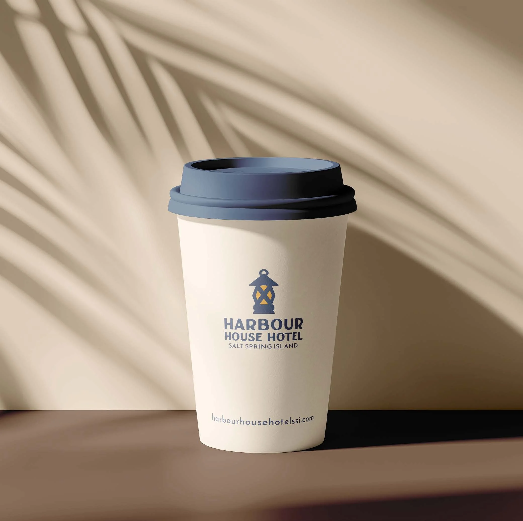
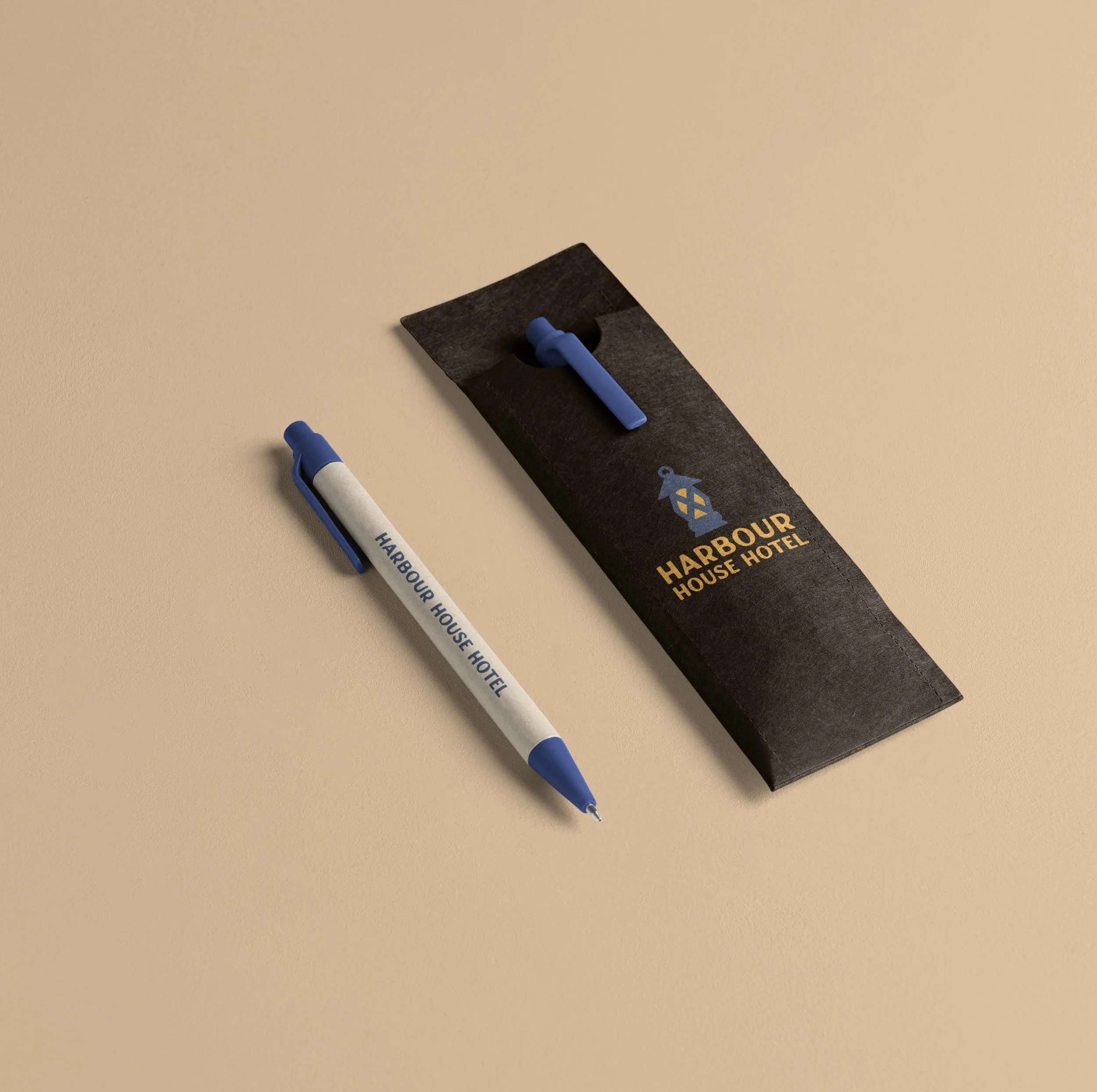
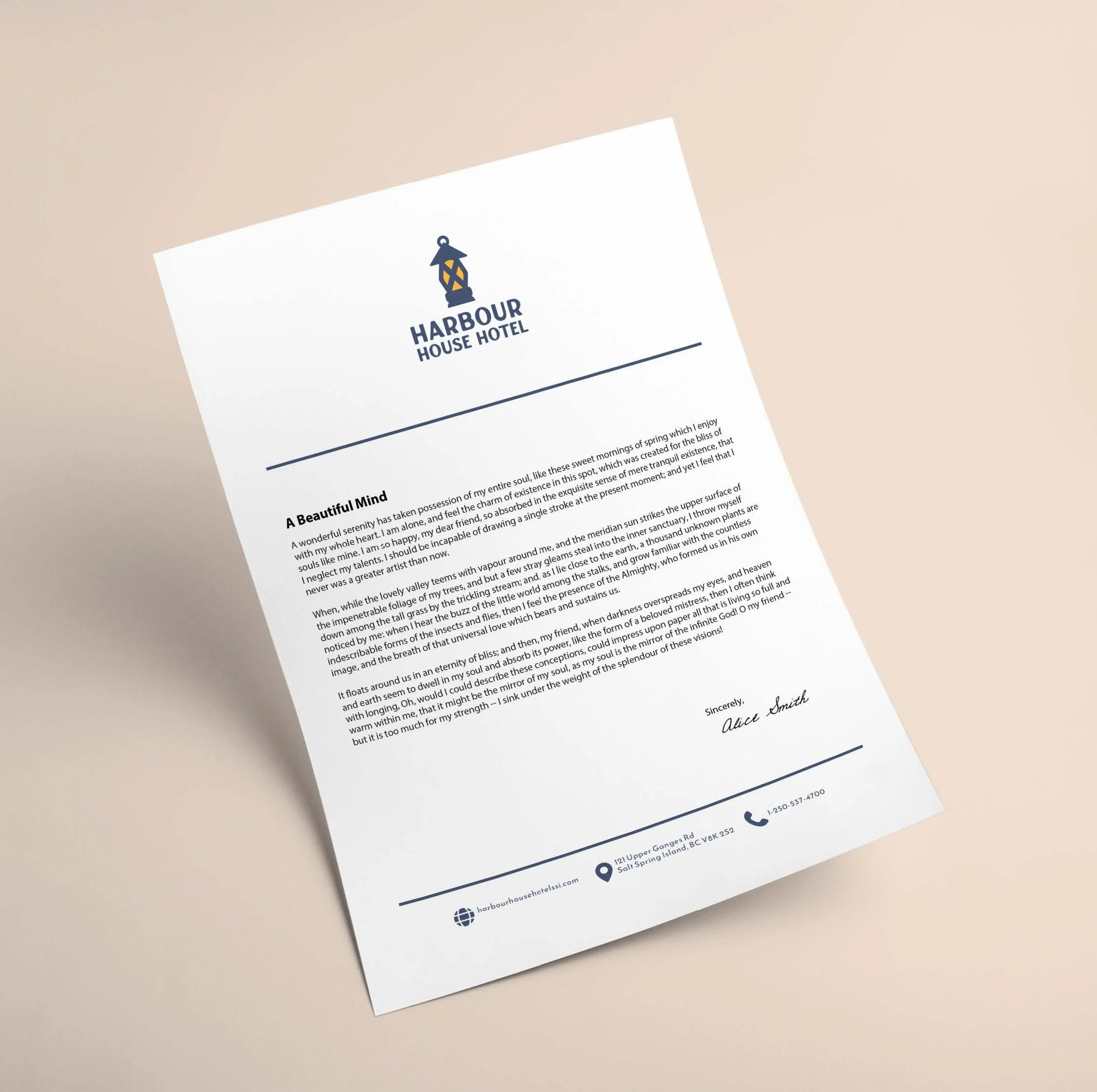
I also wanted to make sure the design was versatile and could work in any situation. Labels, signs, shirts, cups, — anywhere else one could think about having the brand represented on a product.
-
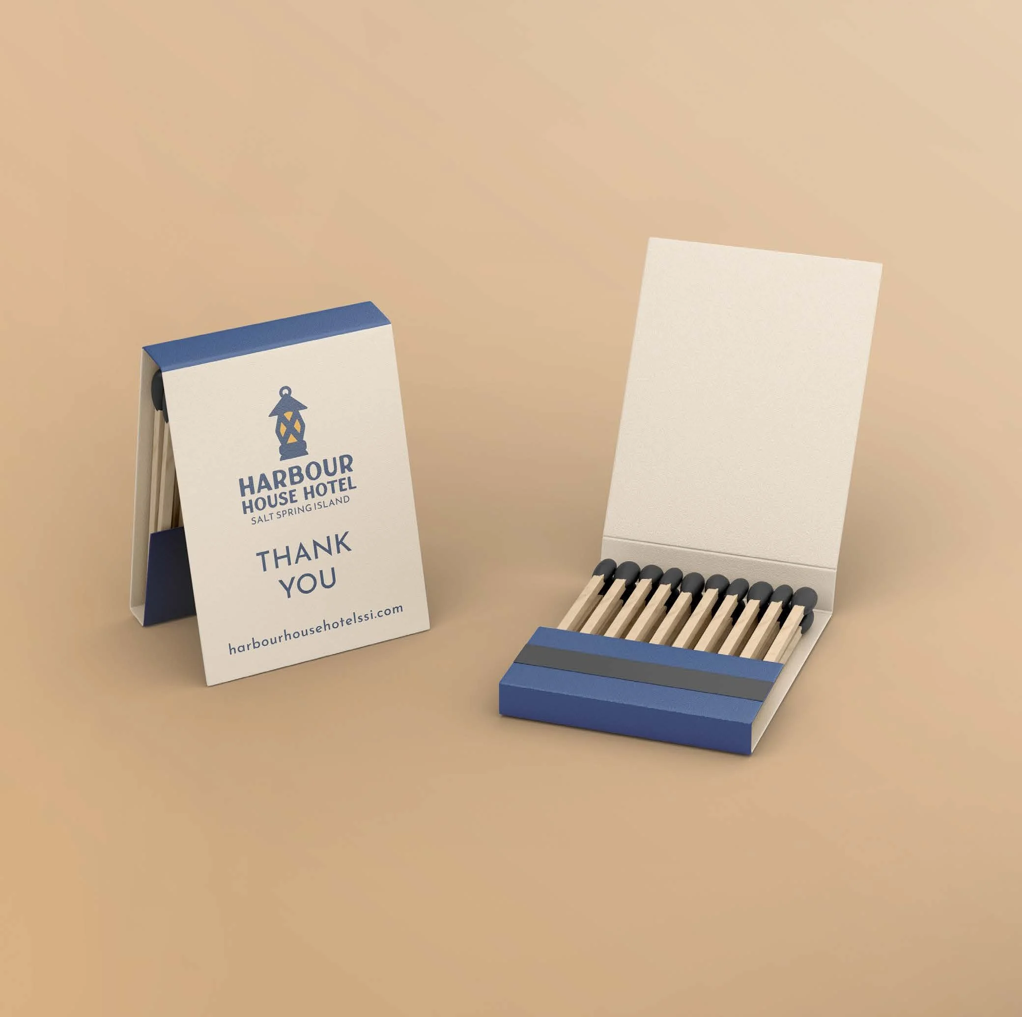
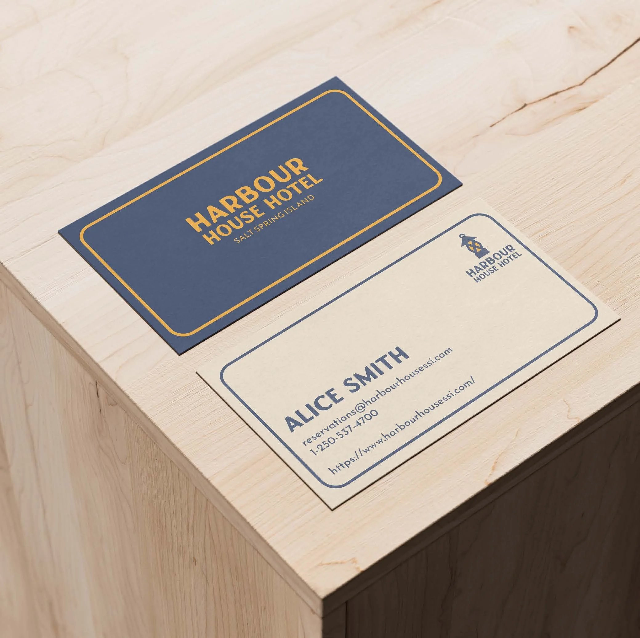
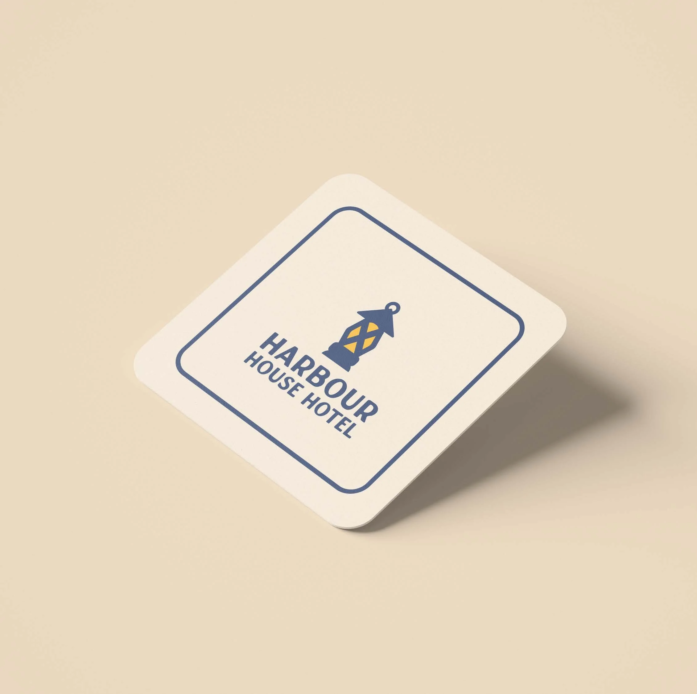
After a good amount of thumbnailing and iteration, I decided on a simple, iconographic representation of a lantern. It’s a symbol that represents light, warmth, and guidance. The final symbol also gave the impression of a lighthouse, a nautical theme which complimented the feeling I was going for.
I settled on a palette of the blue of a stormy sea, ivory-like offwhites, and a deep charcoal-brown black. This kept some of the sophistication of the brand intact while softening it to be more welcoming.
Typographically, I went with a somewhat irregular all caps typeface for the main body which struck a nice balance between handmade and orderly. Complimenting this, I used a quite pointy sans serif for smaller type like the name of the location.
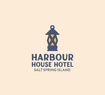
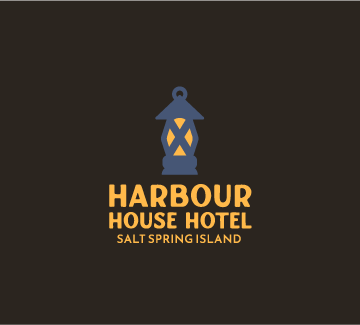
The final brand logo, on light and dark backgrounds.
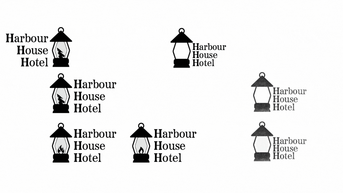
Initial thumbnails. I landed on the lantern motif late in the process.
Further iterations and potential color palettes.